 Fits Every Screen
Fluid grids and flexible layouts
Last reviewed
The short version
- A fluid layout sizes things as a share of the space, not in fixed pixels.
- Flexbox and CSS grid do this by default.
- Images need one extra rule so they never stick out.
- Plain HTML already flows. Your CSS shouldn't fight it.
Start with how plain HTML behaves
Take a page with only HTML and no CSS. Make the window narrower. The browser reflows the text to fit.[1] Nothing sticks out.
That's the starting point. Every layout you add on top should keep that flexibility.
Fixed or fluid?
A fixed width is a number of pixels, like 600. It never moves. A fluid width is a share of the space, such as half of it. It follows the window.
The fluid grid idea is to size page elements in relative units like percentages, not absolute units like pixels.[2]
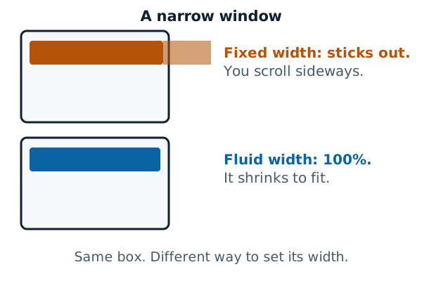
A grid is just the set of columns and rows you lay your content in. In a fluid one, the columns grow and shrink together.
You don't need a pixel-perfect layout for each phone
Responsive sites are built on flexible grids. You don't need a pixel-perfect layout for every device size.[1] There are too many sizes to chase.
Instead you let the grid flex. If a box gets squashed, you fix it at that point. The breakpoints page shows how.
Two tools that flex by default
Modern CSS gives you two layout methods built for this. Flexbox and CSS grid both assume you want a flexible grid, and make one easier to build.[1]
Flexbox lines items up in a row. The items shrink or grow, sharing out the space inside their container.[1]
CSS grid splits the container into tracks. The fr unit shares out the available space between them.[1] This rule makes three tracks of equal share:[1]
.page {
  display: grid;
  grid-template-columns: 1fr 1fr 1fr;
}
Each column takes one part of the available space.[1] Make the window wider and all three grow. Make it narrower and all three shrink.
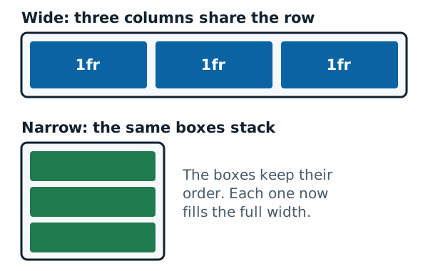
The picture shows what happens when there's very little space. Three skinny columns are hard to read, so the boxes are better stacked. Switching between those two layouts takes a media query. That's the next page.
Don't let lines get too long
Flexible doesn't mean "stretch forever". Long lines of text on a wide monitor are hard to read.[1] Narrow columns can help, but too narrow looks squashed on a phone.[1] A simple fix is a maximum width for the text block. Your layout then flexes between a minimum and a maximum.
Flexible images
An image has its own pixel size. In a narrow column, a big image would spill out.
Flexible images are also sized in relative units, so they can't display outside their containing element.[2] The usual rule sets the image's max-width to 100%:
img {
  max-width: 100%;
}
Fluid images are set to not go past the width of their container.[1] They shrink when the column narrows, but don't grow larger than their own size when the column widens.[1]
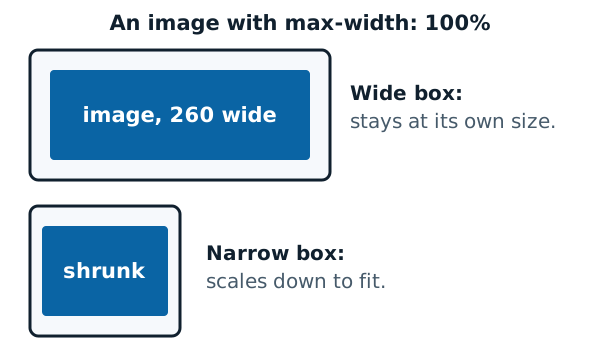
That rule makes one file fit. It doesn't choose a better file for a small screen. For that, see responsive images.
Sources
- Responsive web design, MDN Web Docs (accessed 2026-11-07)
- Responsive web design, Wikipedia (accessed 2026-11-07)