One web page. Every screen.

Phones, tablets and desktops all open the same pages. Responsive design is the approach that lets one page work across the full range of devices and sizes.[1]

This reference explains it one idea at a time, with a picture for each.
Start with the big idea →Test my page →

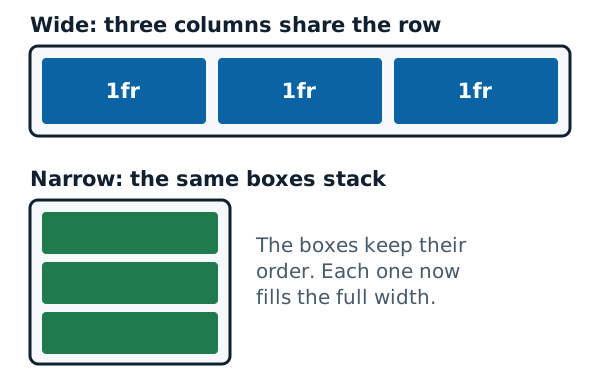
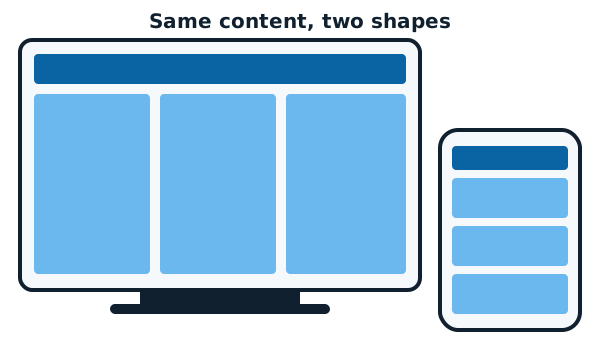
A desktop monitor showing a page with a header bar and three columns, next to a phone showing the same page with a header bar and three stacked boxes.
The same content in two shapes.

Four things to know first

  1. 1
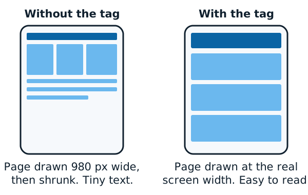
    Two phones. The left one, without the viewport tag, shows a tiny shrunk-down desktop page. The right one, with the tag, shows a page drawn at the real screen width with larger blocks stacked in one column.
    Without the viewport tag, many phones draw a wide page and shrink it.

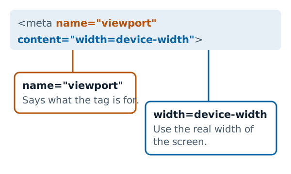
    Tell the phone its real width

    One line in the page head tells mobile browsers to use the device's width.[1]
  2. 2
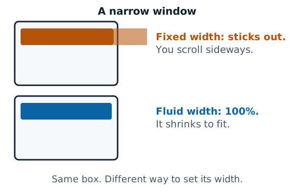
    Two narrow windows. In the top one a box with a fixed width sticks out past the right edge, so you must scroll sideways. In the bottom one a box set to 100 percent width shrinks to fit.
    A fixed width sticks out. A fluid width shrinks to fit.

    Let things stretch

    A fixed width leads to scroll bars on narrow devices and empty space on wide ones.[1] Fluid widths avoid both.
  3. 3
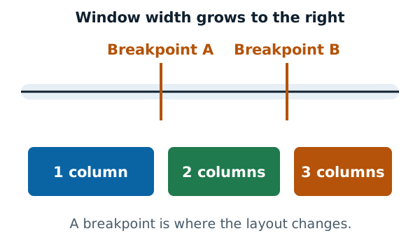
    A line showing window width growing to the right, with two marks labelled Breakpoint A and Breakpoint B. Below it, three zones: 1 column on the left, 2 columns in the middle and 3 columns on the right.
    A breakpoint is where the layout changes.

    Change the layout at a breakpoint

    A media query switches rules on at a certain width. You'll find them useful, though they aren't required.[1]
  4. 4
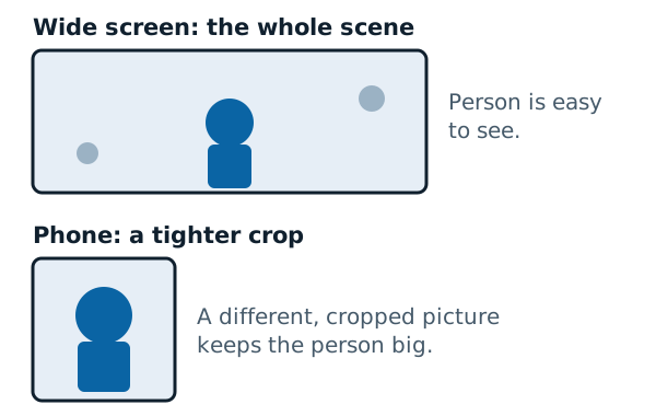
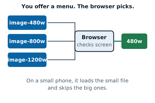
    Three image files labelled 480w, 800w and 1200w feed into a box labelled Browser, which checks the screen. One arrow comes out to the 480w file, the one chosen for a small phone.
    You offer several files. The browser picks one.

    Offer more than one image

    With srcset, you list the image files and the browser picks one.[2]

Every page, grouped by job

Quick answers

Is responsive design a separate tool?

No. It isn't a separate technology. It's an approach.[1]

Do I need media queries?

Not always. They can help, but they aren't a requirement.[1] See the media queries page.

How do I check my page on a phone-sized screen?

Your browser can resize the page area for you. The testing page shows how.

How this site works

  • Facts from documentation are cited and linked to the source.
  • There are no ads, no sponsors and no affiliate links.
  • It doesn't recommend products.

Newest pages

Sources

  1. Responsive web design, MDN Web Docs (accessed 2026-11-07)
  2. Responsive images, MDN Web Docs (accessed 2026-11-07)