 Fits Every Screen
The viewport tag
Last reviewed
The short version
- The viewport is the part of the window where the page shows.
- Phones often pretend their screen is wider than it is.
- One line in the page head tells them to stop pretending.
- Without it, a responsive layout may not switch on.
What the viewport is
The viewport is the area of the window where you can see web content.[1] On a desktop it's usually the browser window. On a phone it's the screen, minus the browser's own buttons.
A page can be bigger than the viewport. Then you scroll. But the viewport width is the guide for how much room the content has, especially from side to side.[1]
The phone that fibs
When smartphones first arrived, most sites were built for desktops. A normal page would look broken on a tiny screen.
So phones used a trick. They drew the page in a pretend window that was wider than the screen, then shrank the result to fit.[1] You could then zoom in and pan around. MDN's example: a screen 640 pixels wide might draw the page 980 pixels wide.[1] The iPhone's default was 980 pixels.[2]
MDN puts it bluntly: mobile browsers tend to lie about their viewport width.[2]
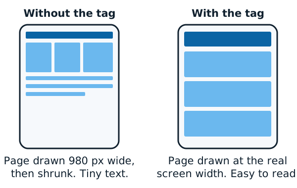
That trick helps old pages. It hurts new, responsive ones. Say the phone claims to be 980 pixels wide. Then a rule meant for 640 or 480 pixels or less will never be used.[1]
The one-line fix
You add a meta tag to the page. A meta tag is a small note in the page's head. It's information for the browser, and visitors don't see it.
This is the recommended one:[1]
<meta name="viewport" content="width=device-width">
It tells mobile browsers to set the viewport width to the device's width.[2] The phone stops pretending. It draws the page at its real width.
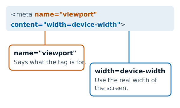
Put it in the <head> of every page. MDN says you should always include it.[2]
What about initial-scale?
You'll often see initial-scale=1 added to the same line. It sets the starting zoom level. The MDN version leaves it out, and says that's a common practice and usually unnecessary.[1]
Don't turn off zooming
Another setting, user-scalable=no, stops visitors from zooming in. Avoid it. MDN warns that it prevents people with low vision from reading the page.[1]
Zoom is a tool many readers rely on. Leave it alone.
Does it change anything on a desktop?
The tag is written for mobile browsers.[2] It's the phone that needs the correction, so you won't see a difference in a normal desktop window.
Next, see how the page content itself stretches: fluid grids and flexible layouts.
Sources
- <meta name="viewport"> HTML attribute value, MDN Web Docs (accessed 2026-11-07)
- Responsive web design, MDN Web Docs (accessed 2026-11-07)