 Fits Every Screen
Testing a page at different screen sizes
Last reviewed
The short version
- Your browser can pretend to be a phone or a tablet. It's built in and free.
- You can also just drag a window narrower.
- Check at many widths, not only at the "standard" ones.
- A real phone is the final test.
Why test at all?
You can't tell if a layout works by reading its CSS. You have to look at it, at several sizes. A box that fits at 700 pixels may overflow at 500.
Luckily, you don't need a pile of devices. Browsers include tools for this. Chrome, Firefox and Safari all have developer tools with viewport resizing.[1]
Method 1: drag the window
The simplest test needs no tools. Open your page and make the browser window narrower by dragging its edge. Watch what happens.
Start wide, then slowly go narrow. Stop whenever something looks wrong. That's often where a breakpoint belongs.
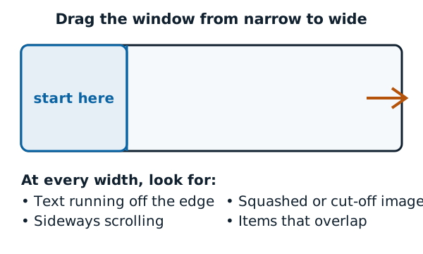
Here's what to look for at each width:
- Text that runs off the edge
- A sideways scroll bar
- Images that are squashed or cut off
- Items that overlap each other
Some browsers won't let you make a window very narrow. That's one reason to use the next method.
Method 2: responsive mode in developer tools
Browsers have a mode that sets the page area to any size you choose. Firefox calls it Responsive Design Mode. It's meant to show how your site will look and behave on different devices.[2]
In Firefox, press Ctrl + Shift + M, or Cmd + Opt + M on a Mac.[2] The page area starts at 320 x 480 pixels.[2] You can change it by typing numbers, or by dragging the bottom-right corner of the viewport.[2] It can also switch between portrait and landscape.[2]
Chrome has the same idea, called device mode. You can drag the handles to resize the viewport to any size you need.[3]
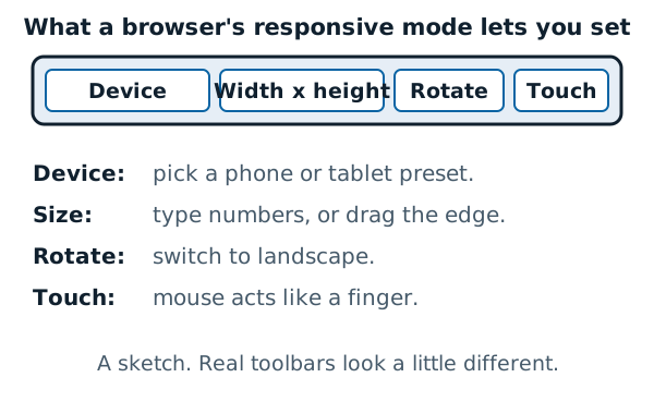
Chrome can also show your media query breakpoints above the viewport. To see them, open the device toolbar's More options menu and pick Show media queries. Then click between them to jump to the width where a breakpoint kicks in.[3] That's a quick way to check each layout in turn.
For a narrow-window example, here's the Wikipedia page from earlier at 390 pixels wide:
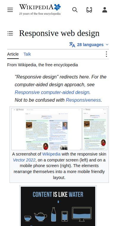
Everything's in one column, and nothing runs off the edge. That's what a pass looks like.
Method 3: a real phone
Responsive mode is a good first look, not the final word. Chrome describes device mode as an approximation of how your page looks and performs on a mobile device.[3] Its advice is that when in doubt, you should actually run your page on a mobile device.[3]
So before you finish, open the page on a real phone. Turn it sideways too.
A short checklist
- Narrow window: one clean column?
- Slowly widen: does the layout change where it should?
- Wide window: are the lines of text still a comfortable length?
- Phone, upright and sideways: can you read and tap everything?
A real phone also shows what a desktop window can't. Without the viewport tag, a responsive design may not work as intended on mobile browsers.[4]
Sources
- Responsive web design, Wikipedia (accessed 2026-11-11)
- Responsive Design Mode, Firefox Source Docs (Mozilla) (accessed 2026-11-11)
- Simulate mobile devices with device mode, Chrome for Developers (accessed 2026-11-11)
- Responsive web design, MDN Web Docs (accessed 2026-11-11)